Tuesday, May 5, 2009

Final assignment


Done...Here is our work and we hope that we had done our very best in producing this project assignment. Last but not least, I would like to take this opportunity to thank all the people who have contributed their comments,suggestions and idea in this project. Thank you..

Monday, April 20, 2009

Assignment 3


( I do not know why I can't upload my swf file into my blog here so I have converted it into gif format Anyhow, I still have the swf file if need any clarification from me. Thanks)

At last I have done one of this..Phewww....The idea was originally from my another blog competition. I have gather the suggestion from all the friends around on how to make a blog that outstandings than others. Well, I hope this is not too bad.

Wednesday, March 18, 2009

Assignment 2


Finally, I have completed the assignment 2..This is more challenging compared to the first one....Anyway,I hope this is not too bad....Because I'm running out of time to do it..
Please comment.Thanks in advance...

Monday, March 9, 2009

Finally completed

Well, thanks to ahteh's for his valuable comment.I think this is the final amendment by me.Thanks everybody for your comments.


This is before commented.


Ta da......This is after commenting by ahteh's....;p

Saturday, March 7, 2009

85.5% completed


Well, this is really really almost completed...After gathering some valuable comments from both of Ahteh's and Ahbee's I changed a little bit of the background and I adjusted some of the font.Here is my work...pls comment...I thank you all in advance..

Step by step

Well, this is my step by step process when I am creating my E-wallpaper.Firstly, I open the image of a building...


After that I crop the and move to another layer because I want it to look bigger when you stand in front of the building. Also,I made the colour to look white onli in this stage.


Next, I adjusted the building in order to look contrast by lowering down the opacity and adding some contrast.


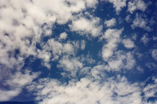
Now, I cropped the image of the clouds.

In here, I try to make the clouds look more brighten by using the changing the layer to 'Pin Light' and I added all the mmu logo and inserted the text.

Lastly, I added one more small box at the bottom of left hand side by clicking on the rectangular tool and draw a square on it. After that, choose the colour that suit the image.Then, put in the text.

80.1% e-wallpaper


Well, this is my 80.1% e-wallpaper completed.After commenting by Dr. Ken and his assistant's for my previous e-wallpaper I decided to redo again. This is because I imagined that they are my client. My client did not satisfy with my the product so I need to redo again. Anyways, I really really really need to thank them for giving me so much of valuable comments. Besides, I need to thank Ah teh who is my leader again because he showed me alot lots lots of method and idea on how to make it looks perfect. Well, basically I just used back all the same materials except I eliminated some unneccessary stuff. I think that the most simplest one is the best one.So, everything back to basic. Of course, I still hope that everybody can comment on this wallpaper so that I can make the last modification in order to get the maximum marks.hehe...I would like to thank in advance for the valuable comments.